How much of last year were you exposed to poor air quality?
Smoke density of zero PM2.5 is desirable and possible. We often get these readings at different times of the year. Why should we settle for an average PM2.5 much higher? Pages 2 and 3 show some great pies for Houston, BC.
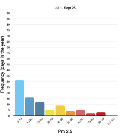
The banner bar graph is Burns Lake over the summer. It shows PM2.5 smoke density and for how many days we experienced that range of density. The colours relate to the BCCDC Health Index. The rest of the charts here show smoke density readings for our communities September 2022 – September 2023.
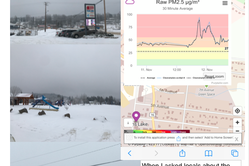
I took a range of density readings for PM 2.5 and grouped them by colour into the same range of readings used for guiding people on determining health risk. It’s not quite like comparing apples to apples since I don’t have access to the same figures, large files nor corrected values but for illustration it’s pretty good. These numbers are raw PM2.5 from the purple air map website. They show huge differences among the seasons, also that socio economic status relates to your exposure levels and more. To fund more analysis like this or discuss, contact us!
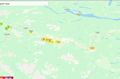
For the Communities of Burns Lake, the Hazeltons, Smithers, Gitanyow and Witset.
Please send me your comments! coordinator@cleanairplan.ca